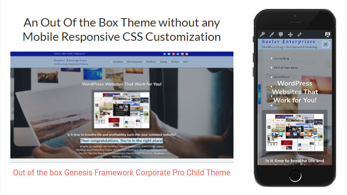
With Google looming in the background demanding mobile responsive sites, developers have been inundated with requests to make WordPress Sites “Mobile Responsive”. There’s just one problem, “Mobile Responsive” is a set of standards involving HTML 5, CSS 3 and in some cases Javascript; it’s about function and performance, while “Mobile Responsive Design” is the combination of standards and presentation. So when someone says “I want my site Mobile Responsive” it’s no different than saying “I want an eCommerce website that makes lot’s of money”.
O.K. great, but….
- What should it to look like?
- How will payment be collected and processed?
- What are you selling?
- How are you going to market it?
The request is simply too vague for any reputable website developer to provide a realistic quote. The good news is that any relatively new site design or WordPress theme is Mobile Responsive out of the box. This means that the themes will perform according to Mobile Responsive standards using Media Queries and Device Break Points to adjust the appearance of the site on assorted mobile devices. Unfortunately that doesn’t mean it will provide a perfect presentation or a specific look without a lot of custom CSS (Design). Now lets take a look at some examples to emphasize the difference between Mobile Responsive and “Mobile Responsive Design”.
An Out Of the Box Theme without any Mobile Responsive CSS Customization

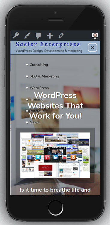
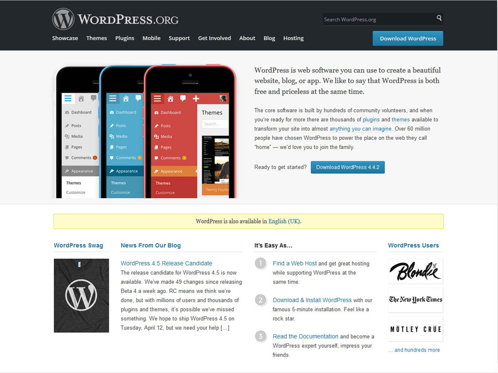
In the above example, we see a modified version of the Genesis Child Theme Focus Pro by StudioPress. Because this modified theme is still in development, it makes an excellent example of how it’s Mobile Responsive out of the box but not a perfect aesthetic presentation. While a number of break points function correctly other elements don’t.
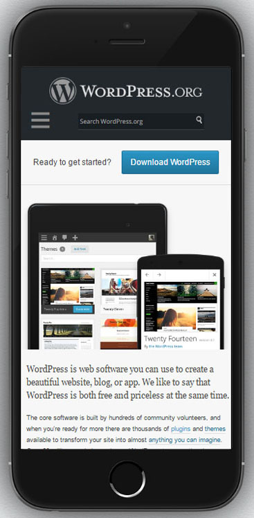
In the above Mobile Image we can easily see the “Hamburger Menu” (nickname for the Hash Mark Menu Icon) Floats under the Hero Image Heading. If we scroll down many more issues would present themselves. These elements need to be adjusted in order to create a “Mobile Responsive Design” that maintains the branding and feel of the “Desktop” version:
So now it’s time to make some Mobile Responsive decisions
When it comes to making your site Mobile Responsive there are basically four approaches you can take.
- Add HTML5 CSS3 Mobile Responsive code to your existing WordPress Theme Adding Mobile Responsive Code to an existing WordPress website isn’t necessarily a cost effective solution because the entire style sheet will need to be adjusted, which is pretty much the same thing as rebuilding the entire website from scratch.
- Convert to an HTML5 CSS3 Mobile Responsive Theme and leave the presentation as it is out of the box. This solution is the most effective for anyone with an older site. It brings the sites code up to current development standards, reducing the risk of conflicts and improving overall search engine rankings (not just Mobile).
- Use CSS to hide unsightly elements from Mobile Devices This option won’t make your site Mobile Responsive but, if used with an HTML5 CSS3 design, it will allow you to hide difficult to control elements of your pages from mobile devices, reducing the costs involved.
- Use a Mobile Responsive WordPress Plugin A plugin would seem to be the easiest way to make your site Mobile Responsive, but like other methods plugins still require compromise and even have some unique drawbacks the other methods don’t. When using a plugin, you still have aesthetic issues and also have the possibility of conflicts with other plugins. In addition to the above issues, the website theme will still be outdated because it’s not using current HTML and CSS standards.
Get an accurate quote, tell your developer what you want
The two main factors to consider when choosing which of these four options is best for you are Cost and Appearance. The less concerned about a specific presentation you are and the more willing to compromise, the less your overall costs will be. Maintaining branding with overall look and feel in a mobile presentation is time intensive and your developer will spend a lot of time tweaking and adjusting (unless they don’t proof their work). So if you want a perfect presentation, expect to pay for it, but if you are willing to compromise your site can be Mobile Responsive without breaking the bank. Just remember, if you want your site Mobile Responsive because of the upcoming Google update – Google doesn’t care what it looks like, just that it’s Mobile Responsive. Another factor to take into consideration is – if a Mobile Site truly needs to look as close as possible to the Desktop version, why do the major Internet and Software companies create spartan versions of their sites instead of spending a fortune making their sites look perfect (see Amazon example below)?
A few more examples of Mobile Responsive Design to help with your decision
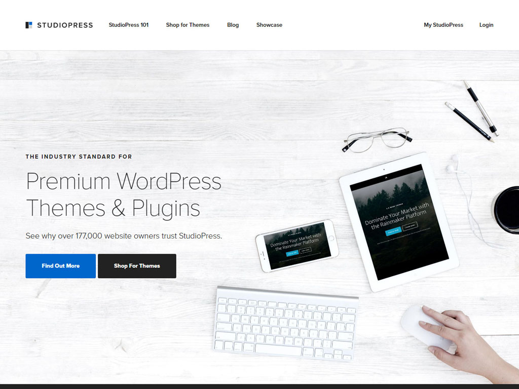
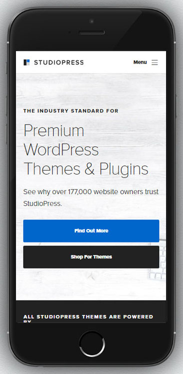
Click on an image below to see how the site looks on an iPhone 6Plus. Each of these designs demonstrates a slightly different approach to Mobile Responsive Design, some more simplistic, others more detailed, but none use plugins. Some choose to maintain most of their branding, others hide elements from mobile devices and Amazon even has an alignment issue.


Share Your Two Cents