In the past, you had to use images to create gradient effects in website designs. However, by using CSS gradients you can reduce load time and bandwidth usage. As an added bonus, CSS gradients look better when zoomed than images because the gradient is generated by the browser, not a graphic file.
There are two types of Gradients in CSS
Both types of gradients, linear and radial, can produce a wide range of effects by applying variables.
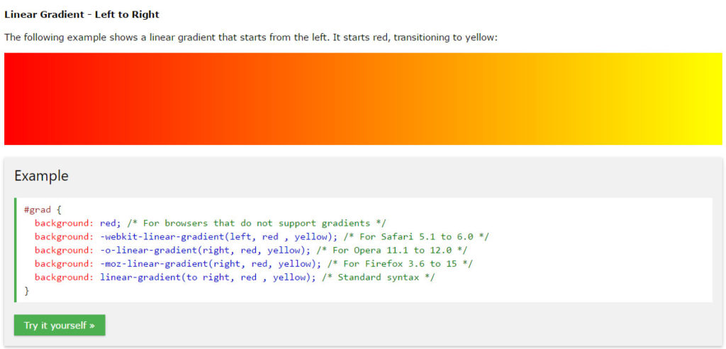
Linear Gradients (defined by direction):
A linear gradient must define at least two color stops. Color stops are the colors you want to render smooth transitions among. You can also set a starting point and a direction (or an angle) along with the gradient effect.
Linear gradients can be customized by specifying: Direction (top, bottom / right, left / diagonal), Angle, Multiple color stops, Transparency, and Repeating.
Radial Gradients (defined by their center):
A radial gradient is defined by its center and also requires that at least two color stops are defined.
Radial gradients can be customized by specifying: Evenly spaced color stops (this is default), differently spaced color stops, set shape, different size Keywords (think position), and repeating a radial-gradient.
Now that you know the basics, check out W3Schools.com to learn about creating CSS3 Gradients!

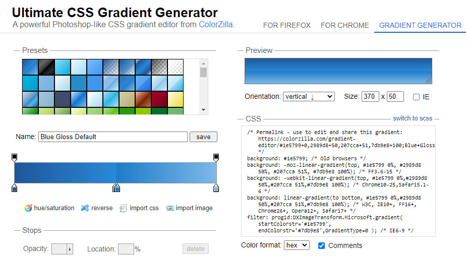
Read the W3Schools Chapter on CSS3 Gradients for examples, demos and sample code. Or if you are feeling lazy, check out ColorZilla’s Ultimate CSS Gradient Generator.
Share Your Two Cents